We start out chasing vibes we've seen on the internet and end up (eventually) typing on beige keycaps.
I've seen it happen.
Not right away, sure. First you discover customs, fall down the rabbit hole, and your lizard brain goes, “Neon. Pastels. RGB. Give me Vaporwave all over my desk.” You want your desk to look like a synthwave album cover had a baby with an arcade carpet. And honestly, that’s part of the fun. The early hobby years for most people are all about expression, chaos, and seeing what happens if you put slime green caps on a lilac TKL and call it tasteful in front of your mates.
But if you hang around long enough, something weird occurs. All the roads seem to quietly curve back towards beige. Or at least towards retro greys, and slightly warm off-whites. The keyboard equivalent of brown dress shoes and a matching belt.
But WHY does beige win out? The thing about keycaps is that living with them is very different to seeing them on a render.
Renders are like Tinder (or Grindr) profiles. Swipe left. Swipe right. Perfect lighting, no cables, your board floating in a void next to a tasteful plant and washboard Abs. (er... I mean ABS keycaps...)
Of course the blazing neon tri-colour set looks incredible there. Of course your desk looks like concept art for a cyberpunk coffee shop. But after six months of using the thing, you start to notice that intense accent colour you loved now screams at you when you’re tired. Wild contrast that looked great in photos is slightly annoying when you’re just trying to bash out emails. Matching mats, cables, cases, artisans and your nail polish (don't judge please it stops me biting them) to one hyper-specific palette is a mini full-time job.
Beige, on the other hand, doesn’t ask anything of you.
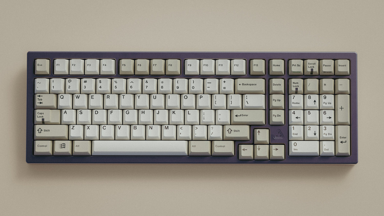
The old-school IBM / Olivetti aesthetic (please go buy some Olivetti) had this nailed decades before we started group buying plastic at 120 quid a set. Muted alphas, slightly darker mods, maybe a soft accent if you’re feeling brave. It looks fine with everything. It works in every lighting condition. Your eyes don’t want to file a grievance with HR after a long day at your desk. There’s a reason classic typewriters and terminals leaned this way, because they were tools first, and the colour supported that.
And thats the reason why most of us follow some version of this arc:
Discovery:
You see a wild build on Reddit and decide your life will be incomplete without a custom board. Beige is boring. You want colour. You want keycaps that look like they've been cursed.
The Honeymoon Period:
You join a few group buys. You buy in-stock sets purely because “woah that purple.” Your desk looks like a candy aisle. You own more keycap sets than actual socks.
The Everything Clashes Phase:
One day you realise your cable, mat, case, caps, mouse, and monitor lightbar are all in different blues. None of them are friends. You start looking enviously at photos of simple beige builds that just… work.
The First Beige (or Olivetti please) Purchase:
You tell yourself it’s just for a work board or just something subtle for zoom calls. You buy something retro: beige with grey mods, or a beige set with an accent colour. You put it on, and your brain goes, Oh. This is comfy.
The Beige Revelation:
Suddenly, every board you keep on your desk 24/7 drifts towards that palette. Maybe slightly warmer, cooler, more grey, more cream: but the bones are the same. You have officially turned into a beige lover.
Beige is life for many of us keyboard nerds and it's the biggest open source colourway of all time. Its the same same, but slightly different with every new set that comes along. If we’re honest, the entire market is built on iterating the same ideas with tiny nudges:
“What if we did Dolch, but slightly warmer?”
“What if we did beige, but the legends are purple?”
“What if it’s Olivetti, but the accent is more teal than blue?”
Sometimes I think its me being cynical. Sometimes I think it’s just the reality of designing within a very constrained format. There are only so many ways you can arrange two or three colours and still keep it usable.
My view is that iteration is fine, cycles are normal, and yes we are going to keep reinventing beige or any other colourway every few years and giving it a new name. Beige, but it’s “desert office.” Beige, but it’s “early web browser.” Beige, but it’s “Scandi productivity.” Whatever helps us tell ourselves it’s different this time.
Looking ahead, I have a few bets/hopes for Keycaps in the next couple of years:
Beige, tailored
We’ll see more sets that are basically beige or beloved colourways at heart, but tuned to specific moods: slightly greenish beige for “vintage terminal,” slightly pinky beige for “warm office”, subtly blue-grey for “brutalist tech desk.” Small shifts from the OG L9 / U9 colour codes. Modern Materials is a start in this direction
Texture and finish might matter more
As we run out of new colour ideas, attention shifts to feel. Different plastics, new materials, different grade of sandblasted finish. We have sorta seen this with the glazed sets, ceramic keys and others. I'm starting to look seriously at bringing back PPS keycaps though.
Colour systems & Child accent kits
Instead of one fixed set, we’ll see families of kits that let you drift between looks. More child-kit esque stuff that is intended to be mixed and matched with other base kits. It was popular years ago and I think we will see it happen again.
But through all of that, I’d bet our collective favourite sets ultimately merge into some flavour of beige. If beige hasn't walked over the hill and bashed you into oblivion yet, it is coming...
Rejoice in the church of beige.


Leave a comment
All comments are moderated before being published.
This site is protected by hCaptcha and the hCaptcha Privacy Policy and Terms of Service apply.